Post by Adele on Jul 5, 2012 13:11:26 GMT -5
Hello Girls!!!
Welcome back from the holiday!!! This week, you need to submit a photo with the 'movement'. We want to see the movement in your photo. Let's see the photo this week
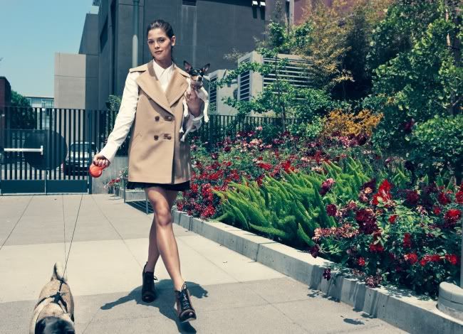
Gwen: While the action of you walking is in essence a movement, this picture still feels very static. I think that has to do largely with the styling. The pulled back hair and the stiff clothing limits the flowing movement in this picture.
Adele: I can feel the movement. The setting and styling are also strong in this photo. You need to work on your face here. Honestly I love to see the fierce side of you more, like we've been seeing for the past weeks. I wished you would give us strong expression in your face.
Amanda: Yeah, I can tell that you're moving, given how your feet are set up, but your clothing is stiff and that takes away from the picture considerably. I do like it for what it is - it's something different, but at the same time this "snobby" look isn't the best you could do. It isn't bad or anything... it just isn't as good as what you've been giving us.
Lee: Very funky jacket! I like it. You've done well in that you're obviously conveying a movement. But I guess there's nothing really spectacular about this photo. I enjoy the colours and the setting a lot but I guess there's just a lack of detail on you, the model.

Gwen: I like the movement of your hair, but I do wish it wasn't covering up your face. The pose is nice, too and I like the styling of your outfit. The background could have been better than just a studio shot, but there's enough energy coming from you that it's not that big of a deal. You have the theme done fairly well this week, but it did come at a small cost of your face.
Adele: I love the jacket and the short but those circle thing in your body kinda distract me. Like Gwen, I love the movement in your hair. But you still can improve your face expression in this photo.
Amanda: I don't like it as much as I want to. It's almost trashy, and that is never a good thing. I love the movement in your hair but I must agree about the face. It's covered and this showcases your hair more than your face. You need them to complement each other and they really don't. I'm happy you didn't use a screenshot, at least
Lee: I don't like it as much as I want to. It's almost trashy, and that is never a good thing. I love the movement in your hair but I must agree about the face. It's covered and this showcases your hair more than your face. You need them to complement each other and they really don't. I'm happy you didn't use a screenshot, at least

Gwen: I'm not completely sold on this photo. I can see some movement in this photo, but I would have liked to have seen the theme taken further. I don't hate the face. Not my favorite, but it's different and I can appreciate different. You definitely tell a story with this picture, so that's a plus, too. The pose isn't my favorite that I've seen, either. It's definitely a mixed bag with you this week. There are good things in this photo and there are areas to improve upon, as well.
Adele: I'm not really convince with your movement, Emmy. But at least, you flips your hair in this shoot. I like the dress and the concept is quite interesting. I wish there would be more movement in your photo
Amanda: I like it. I feel like you are picking up your bag to disembark from this ship and that creates a movementous effect. I like the story value - a new beginning - and I like the face, actually. It's YOU. You continue to impress me and I like it.
Lee: Haha well lucky for you, I think your facial expression is very lovely in this photo! I also think the story is very believable and you did a good job of explaining your photo. Movement wise though, there isn't a lot and we might have to bring out our imagination for it. But I mean, you're obviously bending over to grab a suitcase and that technically is a movement!
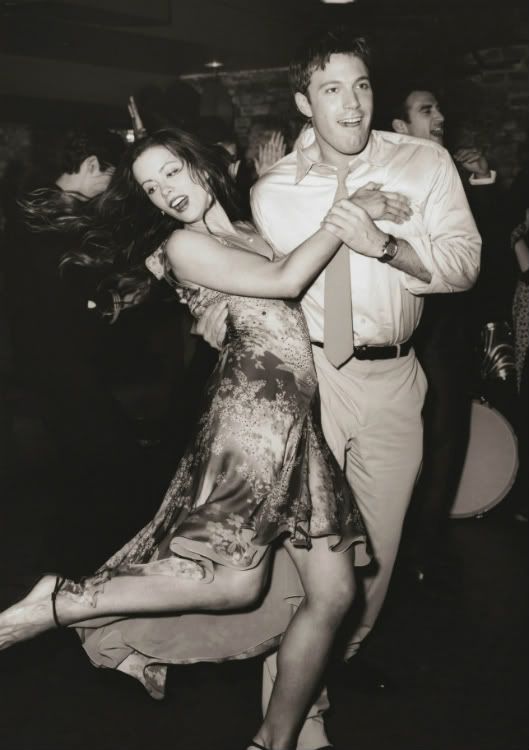
Gwen: Well, the movement is there in this shot. Unfortunately, it comes at the expense of you modeling yourself well. It's actually at the point where this almost looks like a candid shot, but seeing as how you're there with Ben Affleck, I'm going to just guess this is a promotional still. The pose is fine in this and works to show us movement, but your face is just so awkward in this shot. Your mouth is too open and it's a bit off-putting. I also wish this shot was in color.
Adele: The movement is definitely there. But you need to be careful when you move, because the move here, kinda affect your face. You look like you weren't ready here. But I really like the concept. I think you and Ben were having so much fun here.
Amanda: I'm with Gwen. I get the "promo still" vibe completely and the black and white doesn't help - this doesn't seem too much like a throwback to me even with the discolourization. Because there is no colour, I'm drawn straight to your mouth because it's that much of a distraction. You did nail the theme, you are having fun, and the concept is great, it's just that the execution makes this look like a production still from a movie. And not a great one for "modeling" at that.
Lee: Haha this is kinda of weird. Highly agreeable that you did a great job with the theme. But I dunno whether you're the focus, or your partner. It's not very model-esque and I wish there a clear distinction of who's photo this was supposed to be for.

Gwen: No one will be able to argue that you didn't execute the theme this week. There is all kinds of movement going on in this photo. Where you might run into a stumbling block is with this photo is when it comes to the lighting. However, that won't be an issue you'll have with me. While I may normally dislike the overexposure of the light, I love it in this shot. It jives with the vibe so well. The styling is fantastic and I'm finding it hard to pick on something in this shot.
Adele: Katy, I love this. I love the way you move your dress and the lighting is very artistic in this photo. I love the way you stare back at the camera. So convincing. I think you did a great job.
Amanda: Holy s***. This is my favorite photo of all of them you have ever submitted, Katy. I love the effect you have here. I love the movement... wowza. Congrats, Katy. You have shut me up.
Lee: I dunno. This doesn't blow me away in any way lol. You look like a corpse. Am I the only one that finds the light really annoying? Obviously you have nothing to worry about because everyone else loves this, but I don't like it at all to be honest. The dress flying all up in my face is cool but the lighting and the absolutely horrid face hurts me.

Gwen: I want to rip that ruffle off of your midsection badly. It makes you look... larger than you actually are. I do see the movement in this photo, but since it was coming from a breeze, I wish we could have seen more of an effect in that sense. Still, this works well enough for the challenge this week.
Adele: The first thing, I noticed about this photo is your hands. A little bit awkward and I'm still not sure about the movement too, Liv. I want to like your styling but I just can't. At least you gave me neck...
Amanda: If I had to guess the theme, it would be "air element." I don't see movement here. I only see the air blowing around a statue. I don't like your closed eyes or the angle. That ruffled yellow stripe is awful. Sorry Liv, I'm not really fond of this much at all :/
Lee: Unfortunately I think it's pretty obvious you're standing still, not moving. I want to believe you're flying! I do! But you aren't. Therefore, a movement does not exist and that makes me a sad panda.

Gwen: I'm finding it hard to see much movement in this photo. I understand that you are taking a step down and that in its essence is a movement, it's just how you look while doing it. You look very plastic and artificial in this shot. By your pose and posture, it appears that your movements are going to be very choppy, rather than fluid. It's kind of like a Barbie doll where you can move the legs at the hip join and the arms at the shoulders, but other than that, it's stiff and awkward.
Adele: I think the styling and setting are strong but once again, your face become the issue here. I don't have any problem with your movement cause I definitely can see it. Your face look like you weren't ready for the photographer to take your photo. Too bad Mar, because the styling is so cute and stunning but your face ruined the photo for me
Amanda: I am trying my best to like this. I really do like it until I get to your face, which makes me think "Mademoiselle Barbie." That is a huge no-no. Your face is so bad it poisons the good styling, the wonderful setting, and the unique attempt at movement that comes up somewhat short. I am still trying to like this... wish me luck getting over that face.
Lee: I loove your outfit! It's so awesome and the setting is very cool too. But your face is an issue a bit. I don't think this is as bad as the other judges may say but it's nothing great either.

Gwen: Out of your three accounts, my favorite shot this week for this shoot. There's a grace and fluidity in your pose that alludes to the feeling of movement. You also look very classy and elegant in this shot, so that's a nice bonus, too. This week, I have been wanting to see photos in color since black and white will make almost anything look more static while a color photo would show more energy. However, this being in black and white doesn't really bother me since it fits the vibe of the shot so well and actually kind of compliments the type of movement we see in this shot.
Adele: Very graceful. I can feel the move and I believe you also feel your move in your photo. Even though your eyes were close, I still can feel the connection to this photo. The setting is beautiful and the black and white really compliment this photo well.
Amanda: Now this is how to do a shot with your eyes closed. It's graceful and aesthetically pleasing. The black and white helps this effect. The styling is solid and this is definitely a step up from last week, which was good - this is great.
Lee: I like the picture because your movement is subtle but very artistic so that's good! however I'm not a big fan of the overall quality and in my opinion I don't think the black and white helps anything, I wish there was colour! But this is still a nice shot!
Welcome back from the holiday!!! This week, you need to submit a photo with the 'movement'. We want to see the movement in your photo. Let's see the photo this week

Gwen: While the action of you walking is in essence a movement, this picture still feels very static. I think that has to do largely with the styling. The pulled back hair and the stiff clothing limits the flowing movement in this picture.
Adele: I can feel the movement. The setting and styling are also strong in this photo. You need to work on your face here. Honestly I love to see the fierce side of you more, like we've been seeing for the past weeks. I wished you would give us strong expression in your face.
Amanda: Yeah, I can tell that you're moving, given how your feet are set up, but your clothing is stiff and that takes away from the picture considerably. I do like it for what it is - it's something different, but at the same time this "snobby" look isn't the best you could do. It isn't bad or anything... it just isn't as good as what you've been giving us.
Lee: Very funky jacket! I like it. You've done well in that you're obviously conveying a movement. But I guess there's nothing really spectacular about this photo. I enjoy the colours and the setting a lot but I guess there's just a lack of detail on you, the model.

Gwen: I like the movement of your hair, but I do wish it wasn't covering up your face. The pose is nice, too and I like the styling of your outfit. The background could have been better than just a studio shot, but there's enough energy coming from you that it's not that big of a deal. You have the theme done fairly well this week, but it did come at a small cost of your face.
Adele: I love the jacket and the short but those circle thing in your body kinda distract me. Like Gwen, I love the movement in your hair. But you still can improve your face expression in this photo.
Amanda: I don't like it as much as I want to. It's almost trashy, and that is never a good thing. I love the movement in your hair but I must agree about the face. It's covered and this showcases your hair more than your face. You need them to complement each other and they really don't. I'm happy you didn't use a screenshot, at least

Lee: I don't like it as much as I want to. It's almost trashy, and that is never a good thing. I love the movement in your hair but I must agree about the face. It's covered and this showcases your hair more than your face. You need them to complement each other and they really don't. I'm happy you didn't use a screenshot, at least


Gwen: I'm not completely sold on this photo. I can see some movement in this photo, but I would have liked to have seen the theme taken further. I don't hate the face. Not my favorite, but it's different and I can appreciate different. You definitely tell a story with this picture, so that's a plus, too. The pose isn't my favorite that I've seen, either. It's definitely a mixed bag with you this week. There are good things in this photo and there are areas to improve upon, as well.
Adele: I'm not really convince with your movement, Emmy. But at least, you flips your hair in this shoot. I like the dress and the concept is quite interesting. I wish there would be more movement in your photo
Amanda: I like it. I feel like you are picking up your bag to disembark from this ship and that creates a movementous effect. I like the story value - a new beginning - and I like the face, actually. It's YOU. You continue to impress me and I like it.

Lee: Haha well lucky for you, I think your facial expression is very lovely in this photo! I also think the story is very believable and you did a good job of explaining your photo. Movement wise though, there isn't a lot and we might have to bring out our imagination for it. But I mean, you're obviously bending over to grab a suitcase and that technically is a movement!

Gwen: Well, the movement is there in this shot. Unfortunately, it comes at the expense of you modeling yourself well. It's actually at the point where this almost looks like a candid shot, but seeing as how you're there with Ben Affleck, I'm going to just guess this is a promotional still. The pose is fine in this and works to show us movement, but your face is just so awkward in this shot. Your mouth is too open and it's a bit off-putting. I also wish this shot was in color.
Adele: The movement is definitely there. But you need to be careful when you move, because the move here, kinda affect your face. You look like you weren't ready here. But I really like the concept. I think you and Ben were having so much fun here.
Amanda: I'm with Gwen. I get the "promo still" vibe completely and the black and white doesn't help - this doesn't seem too much like a throwback to me even with the discolourization. Because there is no colour, I'm drawn straight to your mouth because it's that much of a distraction. You did nail the theme, you are having fun, and the concept is great, it's just that the execution makes this look like a production still from a movie. And not a great one for "modeling" at that.
Lee: Haha this is kinda of weird. Highly agreeable that you did a great job with the theme. But I dunno whether you're the focus, or your partner. It's not very model-esque and I wish there a clear distinction of who's photo this was supposed to be for.

Gwen: No one will be able to argue that you didn't execute the theme this week. There is all kinds of movement going on in this photo. Where you might run into a stumbling block is with this photo is when it comes to the lighting. However, that won't be an issue you'll have with me. While I may normally dislike the overexposure of the light, I love it in this shot. It jives with the vibe so well. The styling is fantastic and I'm finding it hard to pick on something in this shot.
Adele: Katy, I love this. I love the way you move your dress and the lighting is very artistic in this photo. I love the way you stare back at the camera. So convincing. I think you did a great job.
Amanda: Holy s***. This is my favorite photo of all of them you have ever submitted, Katy. I love the effect you have here. I love the movement... wowza. Congrats, Katy. You have shut me up.
Lee: I dunno. This doesn't blow me away in any way lol. You look like a corpse. Am I the only one that finds the light really annoying? Obviously you have nothing to worry about because everyone else loves this, but I don't like it at all to be honest. The dress flying all up in my face is cool but the lighting and the absolutely horrid face hurts me.

Gwen: I want to rip that ruffle off of your midsection badly. It makes you look... larger than you actually are. I do see the movement in this photo, but since it was coming from a breeze, I wish we could have seen more of an effect in that sense. Still, this works well enough for the challenge this week.
Adele: The first thing, I noticed about this photo is your hands. A little bit awkward and I'm still not sure about the movement too, Liv. I want to like your styling but I just can't. At least you gave me neck...
Amanda: If I had to guess the theme, it would be "air element." I don't see movement here. I only see the air blowing around a statue. I don't like your closed eyes or the angle. That ruffled yellow stripe is awful. Sorry Liv, I'm not really fond of this much at all :/
Lee: Unfortunately I think it's pretty obvious you're standing still, not moving. I want to believe you're flying! I do! But you aren't. Therefore, a movement does not exist and that makes me a sad panda.

Gwen: I'm finding it hard to see much movement in this photo. I understand that you are taking a step down and that in its essence is a movement, it's just how you look while doing it. You look very plastic and artificial in this shot. By your pose and posture, it appears that your movements are going to be very choppy, rather than fluid. It's kind of like a Barbie doll where you can move the legs at the hip join and the arms at the shoulders, but other than that, it's stiff and awkward.
Adele: I think the styling and setting are strong but once again, your face become the issue here. I don't have any problem with your movement cause I definitely can see it. Your face look like you weren't ready for the photographer to take your photo. Too bad Mar, because the styling is so cute and stunning but your face ruined the photo for me
Amanda: I am trying my best to like this. I really do like it until I get to your face, which makes me think "Mademoiselle Barbie." That is a huge no-no. Your face is so bad it poisons the good styling, the wonderful setting, and the unique attempt at movement that comes up somewhat short. I am still trying to like this... wish me luck getting over that face.
Lee: I loove your outfit! It's so awesome and the setting is very cool too. But your face is an issue a bit. I don't think this is as bad as the other judges may say but it's nothing great either.

Gwen: Out of your three accounts, my favorite shot this week for this shoot. There's a grace and fluidity in your pose that alludes to the feeling of movement. You also look very classy and elegant in this shot, so that's a nice bonus, too. This week, I have been wanting to see photos in color since black and white will make almost anything look more static while a color photo would show more energy. However, this being in black and white doesn't really bother me since it fits the vibe of the shot so well and actually kind of compliments the type of movement we see in this shot.
Adele: Very graceful. I can feel the move and I believe you also feel your move in your photo. Even though your eyes were close, I still can feel the connection to this photo. The setting is beautiful and the black and white really compliment this photo well.
Amanda: Now this is how to do a shot with your eyes closed. It's graceful and aesthetically pleasing. The black and white helps this effect. The styling is solid and this is definitely a step up from last week, which was good - this is great.

Lee: I like the picture because your movement is subtle but very artistic so that's good! however I'm not a big fan of the overall quality and in my opinion I don't think the black and white helps anything, I wish there was colour! But this is still a nice shot!

