Post by Adele on Jul 15, 2012 11:59:08 GMT -5
Hello Girls!!!!
We are one step closer to crown the new All Stars Winner!!!
This week, you need to submit two photos, portraying the Good and Evil side of yourself.
Let's start the judging now!!!


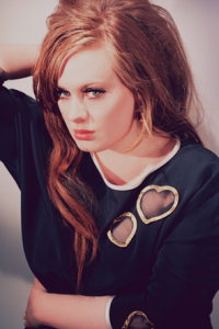
Amanda: "Almost" is right. Your "good" photo is very pleasing on the eyes, but you are missing something critical if you're going the angelic route: A radiant, heavenly smile. The belt you have also doesn't really go with your dress - a nice wide garter belt might be better - but otherwise your styling and hair are flawless. I really do like this, you just need that smile to knock it home.
Your "evil" photo reeks of a constipated expression, and it could be so much better. I also don't see a "witch" at all. I just see dark clothing. I don't get "evil" from this. It's not a bad photo... it just doesn't really do anything for me either way. Not really much to say.
Good luck Ash <3
Natalie: I do wish you were smiling more in your "good" photo, however it is still nice. I think the styling and setting make up for what your face lacks, however, it's nothing special for me from you.
As for your "evil" photo, I'm not sure I get it. Once again, the styling works, but that's just about it. You don't look particularly devious, nor does the setting bode for it. Not your best week, Ash!
Adele: I think you manage to differentiate the good and evil for your styling. I love the vibrant of color in Good while the styling for evil is 'dark'. I'm not a fan of you face expression in Good. I want to see the happiness & sweetness more in it. But I love the eye contact in 'Evil'. You look fierce and strong in it.


Amanda: You are one of the few to take "good" and make it about SMILING. That does WONDERS for you, and makes this absolutely delightful. You seem like a completely innocent girl sitting poolside, having fun in the sun. It's really cute, and I really do like it.
The "evil" one works, but not as effectively as the "good" one. You're sultry, you're a bitch, you're better than everyone else... but the styling doesn't give off as much "evil" as it does "snooty." That's a good word for it - you're snooty and selfish, but not totally evil. That, however, is a decent justification when compared to some of the others. So I don't think it's going to hurt you. I like your "good" one better, but this ain't bad at all.
Well, evil has a lot of dimensions beyond, "I'm going to take this puppy and run it over with a cement mixer." Evil is an attitude, a wilful intent to go out and do harm to another person and not give a darn about the consequences of doing so. That's definitely the attitude I've got going on in this photo - I'll hurt anybody, for any reason, and I'll laugh merrily while doing so.
Natalie: I'm inclined to agree with Amanda- your "evil" photo isn't bad, it's just not as good as your "good" one. Your smile is radiant in your "good" photo, and it's a really strong shot overall. While you do look snooty, which is a from of evil, the styling/setting aren't really cutting it for me. Sorry Emmy!
Adele: The 'Good' photo for me is perfect. I love the smile, the setting and you looks so beautiful and lively in the photo. I love the styling in 'Evil'. And I quite like your face. Maybe it wasn't as strong as your 'Good' one but I think you have a solid week this week, Em.
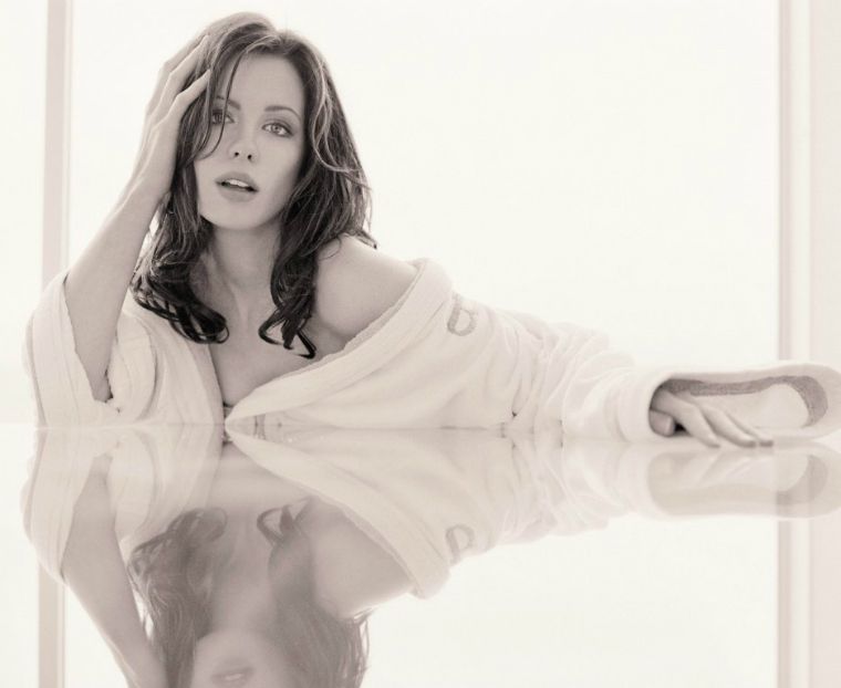
Amanda: Your "good" one gives off that aura of pureness due to the whiteness, but the desaturation doesn't help, in my eyes. If this were a photo in colour with the same pure, white vibe, it would be truly fantastic - a gray table with your skin radiating, lighting up the room... that would have made this into something else. I really do like it - it just isn't much refreshing as it could be. It is hot, though.
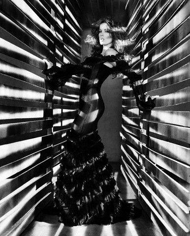
I don't know about your "evil" shot. The setting is superb, but it completely overwhelms you! Your expression IS fierce, but I don't notice it - I'm drawn to everything else BUT you. It took me several minutes to even notice that you've got that Cruella DeVille vibe going on. Now I do see "evil" because of that, but I can't get over the overwhelming setting - it's good, it's just that... you're not the centrepoint, and that's... not good.
Nat: I actually disagree with Amanda here. I like your "evil" one more than I do the "good" one. In your "good" photo, you really just look confused. I don't think the B&W does anything for you there, and I think you look more out of it than anything. In your "evil" photo, the lighting is a tad distracting but it's very artistic, and I like that. I appreciate the contrast between the two, but I wish you were showing more in your "good" photo. Still, not a bad week from you, Kate.
Adele: I agree with Nat. I love your 'Evil' one. The concept is brilliant. I can felt the evil in you from this photo. Good job for that. And for 'Good', Nat was right. You look confused and your face was stiff in this photo. I don't feel connected to this photo.


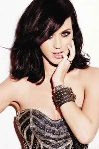
Amanda: I don't like your "evil" one at all. Is this you, or is that Lady Gaga? You seriously look like the latter, and although the setting is good, you're like a mannequin designed to blend into it. Your pose also makes you look rather... bulky, and not in a good way, and given the poor size and quality, I make no connection whatsoever with you, and therefore can't see "evil" in the slightest. That's something I never like, and given the other problems... I really can't say much nice about this, sorry Katy :/
The good photo, however, is a LOT better. You have this innocent vibe amplified by the flowers, and you seem at peace. You're also smizing, which means POINTS for you. It really is a nice photo and I get the connection here that I didn't with your other one. It isn't my favorite photo in the world or anything - an outdoor setting might have hit this one out of the park, however - but it's good enough to redeem your first one. Well done.
Nat: Oh Katy, I really don't like the evil one. I don't even think it looks particularly evil- I think you look empty. The setting is some weird green, and I just don't really get it. I do like your "good" photo, however. You look really sweet and welcoming, and the pink and flowers are a great ad. You did a great job on your "good" photo, so nice work there! Also, I have an issue with the quality of the "evil" photo. This isn't our first issue with you, with that. I have a feeling if you worked on it, you could really do some damage in this competition.
Adele. Hmmm. Guess I'm the only one who really love the 'Evil'. I love that photo. Very high fashion and the concept is very unique and different. And the setting too was so interesting. Maybe a High Fashion Prison? If the size is better than this, it would be more amazing. As for good one, another solid photo from you. I love the flower, you look so sweet. And the contrast between the 'Good' and 'Evil' is shown from your photo.


Amanda: Your "good" shot is definitely pretty, but it's also boring. It has a pureness to it, and the flower (is that a rose or tulip? Can't tell) adds a nice touch - it's just that you're not doing anything to own it, to make you stand out. Your hair is fabulous, but having another blank expression, though prettier than last week, is contributing to this - I'm not going to remember this. It doesn't have the "wow" factor. It's just... a pretty picture.
The "evil" one is... just a "bad girl," really. And it's not taken to the extreme. It's kind of plain - I don't get "evil" from it. I don't get much of anything from it, really. I look at it, then I go here to type, and I forget what I'm saying. That can't be a good thing. Something needs to stand out and it doesn't. This is just okay for me, Marion - and at this stage, we need more than that.
Nat: I'm inclined to agree with Amanda for this photo shoot... Both of your photos bore me to a certain extent. They both fit the theme well, but neither of them have any wow factor, and we're sort of looking for that at this stage. I can see the contrast between the two, which is nice, but I'm just not overly impressed. Honestly, Marion, it'll come down to how the other girls did this week.
Adele: For the 'Good' one, I think the styling is okay. But you body language and pose didn't really work for me. As for the evil, the make-up and style are good. I like it. But once again, your pose in this photo looks awkward and weak for me. I don't feel the energy in it.


Amanda: The "good" photo definitely shows goodness, but I don't see much modeling value here - this looks like it's nearly candid, and since it's a closed-eye profile shot, you don't steal my attention in any shape or form. The idea is immensely cute and it reeks of goodness, but I see more "mother" than "model" here by a LONG SHOT.
Your "bad" shot I have mixed feelings about. On one hand, it's overwhelmingly artistic, and that's a GOOD thing, and I LOVE the dagger and how it adds a bloody, cold effect to a dark, black-and-white photo. The main problem I have, however, is that the photo is not centralized; there's nothing in it that pops out at me, whether it be you or the guy - in fact, the tattoos and the, uh... live scorpion are what catch my eye. Your face is shadowy and the guy is nearly invisible - there's no question that this is a modeling photograph, and I love the artistic merit, but this is just missing the attention-grabber it deserves. It won't Liv you straight to sequester, though, but when mixed with your first photo, it depends on how everyone else does.
Nat: I find you to be more of a model in the first photograph than in the second. You're not really connecting with the camera in the "good" photo, which is a problem. You do have awesome theme integration, so that's going to help, but I'm worried about the level of modelling in your "good" photo. While I like how you look like a model with your expression in the "evil" photo, your setting overwhelms you just a bit. Still, it shouldn't hurt you too badly. Not a bad week for you, Monica!
Adele: Well, I can't say a bad thing about you being a mom for the first photo. But Amanda was right. Modeling value!!!!! As for the 'Evil' one. I really like that photo. It reminds me to 'Bonnie & Clyde'. Very artistic and unique. Good job, Mow!!!
We are one step closer to crown the new All Stars Winner!!!
This week, you need to submit two photos, portraying the Good and Evil side of yourself.
Let's start the judging now!!!


Amanda: "Almost" is right. Your "good" photo is very pleasing on the eyes, but you are missing something critical if you're going the angelic route: A radiant, heavenly smile. The belt you have also doesn't really go with your dress - a nice wide garter belt might be better - but otherwise your styling and hair are flawless. I really do like this, you just need that smile to knock it home.
Your "evil" photo reeks of a constipated expression, and it could be so much better. I also don't see a "witch" at all. I just see dark clothing. I don't get "evil" from this. It's not a bad photo... it just doesn't really do anything for me either way. Not really much to say.
Good luck Ash <3
Natalie: I do wish you were smiling more in your "good" photo, however it is still nice. I think the styling and setting make up for what your face lacks, however, it's nothing special for me from you.
As for your "evil" photo, I'm not sure I get it. Once again, the styling works, but that's just about it. You don't look particularly devious, nor does the setting bode for it. Not your best week, Ash!
Adele: I think you manage to differentiate the good and evil for your styling. I love the vibrant of color in Good while the styling for evil is 'dark'. I'm not a fan of you face expression in Good. I want to see the happiness & sweetness more in it. But I love the eye contact in 'Evil'. You look fierce and strong in it.


Amanda: You are one of the few to take "good" and make it about SMILING. That does WONDERS for you, and makes this absolutely delightful. You seem like a completely innocent girl sitting poolside, having fun in the sun. It's really cute, and I really do like it.
The "evil" one works, but not as effectively as the "good" one. You're sultry, you're a bitch, you're better than everyone else... but the styling doesn't give off as much "evil" as it does "snooty." That's a good word for it - you're snooty and selfish, but not totally evil. That, however, is a decent justification when compared to some of the others. So I don't think it's going to hurt you. I like your "good" one better, but this ain't bad at all.
Well, evil has a lot of dimensions beyond, "I'm going to take this puppy and run it over with a cement mixer." Evil is an attitude, a wilful intent to go out and do harm to another person and not give a darn about the consequences of doing so. That's definitely the attitude I've got going on in this photo - I'll hurt anybody, for any reason, and I'll laugh merrily while doing so.
Natalie: I'm inclined to agree with Amanda- your "evil" photo isn't bad, it's just not as good as your "good" one. Your smile is radiant in your "good" photo, and it's a really strong shot overall. While you do look snooty, which is a from of evil, the styling/setting aren't really cutting it for me. Sorry Emmy!
Adele: The 'Good' photo for me is perfect. I love the smile, the setting and you looks so beautiful and lively in the photo. I love the styling in 'Evil'. And I quite like your face. Maybe it wasn't as strong as your 'Good' one but I think you have a solid week this week, Em.


Amanda: Your "good" one gives off that aura of pureness due to the whiteness, but the desaturation doesn't help, in my eyes. If this were a photo in colour with the same pure, white vibe, it would be truly fantastic - a gray table with your skin radiating, lighting up the room... that would have made this into something else. I really do like it - it just isn't much refreshing as it could be. It is hot, though.
I don't know about your "evil" shot. The setting is superb, but it completely overwhelms you! Your expression IS fierce, but I don't notice it - I'm drawn to everything else BUT you. It took me several minutes to even notice that you've got that Cruella DeVille vibe going on. Now I do see "evil" because of that, but I can't get over the overwhelming setting - it's good, it's just that... you're not the centrepoint, and that's... not good.
Nat: I actually disagree with Amanda here. I like your "evil" one more than I do the "good" one. In your "good" photo, you really just look confused. I don't think the B&W does anything for you there, and I think you look more out of it than anything. In your "evil" photo, the lighting is a tad distracting but it's very artistic, and I like that. I appreciate the contrast between the two, but I wish you were showing more in your "good" photo. Still, not a bad week from you, Kate.
Adele: I agree with Nat. I love your 'Evil' one. The concept is brilliant. I can felt the evil in you from this photo. Good job for that. And for 'Good', Nat was right. You look confused and your face was stiff in this photo. I don't feel connected to this photo.


Amanda: I don't like your "evil" one at all. Is this you, or is that Lady Gaga? You seriously look like the latter, and although the setting is good, you're like a mannequin designed to blend into it. Your pose also makes you look rather... bulky, and not in a good way, and given the poor size and quality, I make no connection whatsoever with you, and therefore can't see "evil" in the slightest. That's something I never like, and given the other problems... I really can't say much nice about this, sorry Katy :/
The good photo, however, is a LOT better. You have this innocent vibe amplified by the flowers, and you seem at peace. You're also smizing, which means POINTS for you. It really is a nice photo and I get the connection here that I didn't with your other one. It isn't my favorite photo in the world or anything - an outdoor setting might have hit this one out of the park, however - but it's good enough to redeem your first one. Well done.
Nat: Oh Katy, I really don't like the evil one. I don't even think it looks particularly evil- I think you look empty. The setting is some weird green, and I just don't really get it. I do like your "good" photo, however. You look really sweet and welcoming, and the pink and flowers are a great ad. You did a great job on your "good" photo, so nice work there! Also, I have an issue with the quality of the "evil" photo. This isn't our first issue with you, with that. I have a feeling if you worked on it, you could really do some damage in this competition.
Adele. Hmmm. Guess I'm the only one who really love the 'Evil'. I love that photo. Very high fashion and the concept is very unique and different. And the setting too was so interesting. Maybe a High Fashion Prison? If the size is better than this, it would be more amazing. As for good one, another solid photo from you. I love the flower, you look so sweet. And the contrast between the 'Good' and 'Evil' is shown from your photo.


Amanda: Your "good" shot is definitely pretty, but it's also boring. It has a pureness to it, and the flower (is that a rose or tulip? Can't tell) adds a nice touch - it's just that you're not doing anything to own it, to make you stand out. Your hair is fabulous, but having another blank expression, though prettier than last week, is contributing to this - I'm not going to remember this. It doesn't have the "wow" factor. It's just... a pretty picture.
The "evil" one is... just a "bad girl," really. And it's not taken to the extreme. It's kind of plain - I don't get "evil" from it. I don't get much of anything from it, really. I look at it, then I go here to type, and I forget what I'm saying. That can't be a good thing. Something needs to stand out and it doesn't. This is just okay for me, Marion - and at this stage, we need more than that.
Nat: I'm inclined to agree with Amanda for this photo shoot... Both of your photos bore me to a certain extent. They both fit the theme well, but neither of them have any wow factor, and we're sort of looking for that at this stage. I can see the contrast between the two, which is nice, but I'm just not overly impressed. Honestly, Marion, it'll come down to how the other girls did this week.
Adele: For the 'Good' one, I think the styling is okay. But you body language and pose didn't really work for me. As for the evil, the make-up and style are good. I like it. But once again, your pose in this photo looks awkward and weak for me. I don't feel the energy in it.


Amanda: The "good" photo definitely shows goodness, but I don't see much modeling value here - this looks like it's nearly candid, and since it's a closed-eye profile shot, you don't steal my attention in any shape or form. The idea is immensely cute and it reeks of goodness, but I see more "mother" than "model" here by a LONG SHOT.
Your "bad" shot I have mixed feelings about. On one hand, it's overwhelmingly artistic, and that's a GOOD thing, and I LOVE the dagger and how it adds a bloody, cold effect to a dark, black-and-white photo. The main problem I have, however, is that the photo is not centralized; there's nothing in it that pops out at me, whether it be you or the guy - in fact, the tattoos and the, uh... live scorpion are what catch my eye. Your face is shadowy and the guy is nearly invisible - there's no question that this is a modeling photograph, and I love the artistic merit, but this is just missing the attention-grabber it deserves. It won't Liv you straight to sequester, though, but when mixed with your first photo, it depends on how everyone else does.
Nat: I find you to be more of a model in the first photograph than in the second. You're not really connecting with the camera in the "good" photo, which is a problem. You do have awesome theme integration, so that's going to help, but I'm worried about the level of modelling in your "good" photo. While I like how you look like a model with your expression in the "evil" photo, your setting overwhelms you just a bit. Still, it shouldn't hurt you too badly. Not a bad week for you, Monica!
Adele: Well, I can't say a bad thing about you being a mom for the first photo. But Amanda was right. Modeling value!!!!! As for the 'Evil' one. I really like that photo. It reminds me to 'Bonnie & Clyde'. Very artistic and unique. Good job, Mow!!!

