Post by Adele on Jun 13, 2012 5:04:45 GMT -5
Hello Final 13!!!
Welcome to your Second Judging Session. This week you need to submit a photo for Shampoo Advertisement. Gwen couldn't make it this week so let's start our judging session for this week.
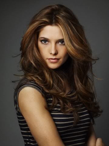
LMH: Oooh I love your hair in this picture! You look gorgeous! I like the confident look on your face and I could see this on a Shampoo Ad for sure. I give two thumbs up on this one!
Adele: Beautiful hair. I think you hair is the strongest element in the photo which is good for this week. Really love your pose this week. Great angle.
Nat: I think this is a great week for you, Ashley. You look gorgeous, and your hair is perfect! I love how simple everything else is- it totally brings out your hair. Great job!
Amanda: This is definitely the right week for a studio shoot. Your hair is amazingly fierce and radiant at the same time, and it clearly steals he spotlight here. Your face is bland, but that's okay - it make this even more suitable for shampoo. Nicely done, Ash!

LMH: Stunning! This is fantastic, I love everything about it. Your hair is very shiny and your smile is very pretty. I'm really happy with the improvement you've made from last the photo shoot. Great job Britney!
Adele: Very sweet and cute. And your hairstyle looks good on you. I think your very shiny and healthy and I'm so going to buy the shampoo with this photo
Nat: Huge improvement from last week. You look super sweet, and the healthy hair is definitely noticeable. Thought maybe you'd go with this, though:
Amanda: I'm not overly thrilled that you used an actual shampoo ad here, because that makes this... unoriginal. Despite that, it's a huge improvement from last round - your eyes and smile are great and compliment your shining hair really nicely. You're pretty, and this shampoo makes me pretty. I want it. Good job.

Lee: Oooh Charlize you are one hot mama! I love the size of the photo because you can really see everything and the quality is flawless. I love your eyes, your lips, your skin, your earrings, and most importantly your hair! I think the hair may not be the main focal point however so that might be a bit of a problem. Also, I'm not a big fan of the arms holding the camera shot thingy. I think there are a lot of pros to this photo so I think it's great.
Amanda: I am not so sure about this. It looks like you're holding the camera and taking a picture of yourself, which seems sort of awkward for a shampoo ad. That's the first thing I see, far before your hair. Your hair is fabulous, though your eyes seem somewhat funky. This is still hot and I do like it, but I don't love it.
Adele: Yeah, the angle made it look like you were taking your own picture. But you did look beautiful and flawless like what Min Ho said earlier. The quality is great. I think you can do more to make your hair stand out in this photo
Natalie: I agree. Not a fan of the angle, but your hair is nice here so it's not too bad. I also wish you were looking a little more at the viewer.

Adele: Wow.. Lots of Hair, Emmy!!! I wonder how many shampoo did you used for a month. I think the hair is great but your expression in this photo is a little bit emotion-less. Pretty much dead for me. It was like you just 'popping out' from nowhere and didn't ready to take a photo.
Nat: I love your hair in this. It's so luscious and you look stunning. Again, I love the simplicity, because it allows focus on the hair. Great job!
Lee: Haha oh dear, second straight week I have a problem with your expression! What's up with that! I don't really like anything about this photo :/ There is a lot of hair everywhere but it just doesn't look good to be honest. I understand why you thought this would be good for a Shampoo Ad but I'll have to respectfully disagree.
Amanda: I don't like the lighting, and that may be why my colleagues aren't fond of your face - it's unbalanced and unnaturally shaded. Your hair is fantastic, and I could see this as a shampoo ad, but I can't get over the darkness on your face. Your eyes are rich, your lips are not. I still like it, but it isn't your best. It's still plenty
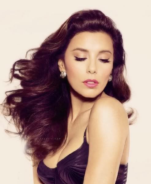
Adele: The hair is great. But my main concern is with your face. I don't mind if you chose not to look at the camera but you need to make sure that the connection is still wrong. As a customer, I'm not sure if the photo really convinced me to buy the shampoo since I don't feel the connection
Nat: I agree with Adele here. I love your hair, but you're not looking at the camera, which is problematic. Open your eyes, and you'd have had a great photo here. It's just good, though.
Lee: In theory, I actually think it's okay to look away in the photo because the way the wind is blowing to the side, your hair is the main focus and that's a plus. However, this doesn't mean I like how your face is turning away. The expression is kind of odd and It would have been nice to see your pretty eyes too. It's not greatly executed, but I still think this is a pretty good shot for you.
Amanda: I don't mind that your face is turning away as much as I mind that your eyes are closed. That's repulsing me, and it's something I notice before I see your shimmering hair. Your hair is amazing and suitable for a shampoo ad, but your face is just... blank because your eyes are closed. Overall, this is just okay. I know you can do better!

Adele: Oh no, J-Hud.. I'm not really sold on this one. Not really a big fan of your hair styling. And your face failed to attract if I'm a customer. I like the make-up though.
Natalie: I'm not too big of a fan of this, either. Your face isn't selling the product, and neither is your hair. The logo at the bottom is huge and it could have been cropped out of this completely, since you really only need your hair. Not a fan this week, sorry!
Lee: Uh oh double trouble haha. Let me guess, you wanted to show more of a 'natural' look than a typical glamour shot. I like your attitude! Unfortunately, this is bad. Your hair is nice and full at the top and then..PLOP! It's all dead and not appealing really. You crapped the bed in this one, sorry!
Come on let's be serious here, the logo is completely out of the way in the corner and isn't in the way from her picture lol. Though I still think this is a weak effort, I don't think I hate it as much as I did before after looking at everyone else's pictures. You'll need Lady Luck on your side though that's for sure.
Amanda: I agree with Nat about the logo, sorry Ho. That kind of logo is just too big and my eyes are immediately drawn to it before anything else. Your face is dead, and although your hair is good, it isn't as strong as it could be! It looks somewhat snarled, and this just doesn't have the energy we want from you! Sorry, Jennifer, I don't really like this, either :/
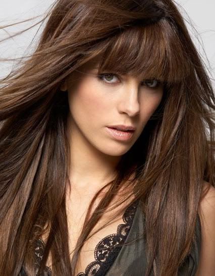
Adele: Love the fringe!! Great hair. Beautiful photo. I can see this photo being served as the shampoo advertisement cater to the urban customers. Great eye-contact. Simply gorgeous for me. Effortless
Natalie: I like this, though I wish it were zoomed out just a smidgen. You look gorgeous, but I can't see all of your hair. From what I can see, though, it looks great. I also like the bangs. They're in style, and thus this would appeal to that range of customers. Good job!
Lee: Am I the only one who doesn't like the bangs? They seem extremely heavy on your face like a giant frying pan or something. But if that's the style...haha. Anyways other than that I like the eye contact as well and although I also wish we could see all of your hair, it looks pretty good. Next time remember to put on Chapstick!!!
Amanda: Your lips could use a little touching up, yes. Your bangs are a bit too long for me, but I still like them. I do, however, agree with Nat that I want to see all of your hair! I really can't see this being used as a shampoo ad because of how it's cropped. We only get to see part of the hair! If we could see the whole thing, this would be near flawless. Good work!

Lee: Hmmmmmm.There's a lot of potential but I think in the end it doesn't turn out great. The hair is actually pretty good. I like the way it blows in the air and it's acceptable. However, you look like an insane person who's a domestic abuse victim lol. The make up looks like bruises and your lips look a bit damaged. Like this picture is too "artsy" to be a commercial Shampoo Ad unfortunately. You are soo pretty though!
Amanda: I don't like this, really. Like Ho, I see you as some sort of insane pothead, some sort of Sierra type
Forget I said that. Your hair is flawless, but the rest of the picture is just creepy. I'm not sold on your outfit, and your purplish eyeshadow is overdone. The background is nice, actually, and I can see it being used for some sort of botanical shampoo. However, that face is just @_@ to me, and unfortunately, that's a big cause for concern :/
Adele: Your hair is pretty but the concept is an issue here. You need to work on your face. The expression didn't really suited you in this photo. But, I think your hair might save you from the elimination because I like your hair
Natalie: I agree with the other judges here. Your hair is good, but I notice your face far before it. You just look awkward. Work on your expression and you'll receive higher marks!

Lee: This is a good improvement from last shoot! I think you look amazing and your outfit is very cool. I actually really like your hair too, it looks very beautiful and it's not over the top like a lot of Shampoo Ad's and I think that's quite appealing
Amanda: Not sure how I feel about the cropping here, since your hair doesn't steal the show. Crop some of this out to get rid of those bracelets so we can see your hair steal the show! Your hair is fantastic and this could definitely be justified for a shampoo ad. It's a big step up from last round, and even with the qualms I have, I like it. Good job
Adele: The smile is too much I think but overall, I think you did a great job. Very commercial, approachable and your hair looks great. Overall, I like this photo. Good job, Katy
Natalie: This is just okay for me, Katy. Your hair looks a bit mangy, and I don't love it. This is more fitting for a smile ad than anything for me. Not a huge fan this week- sorry!

Adele: You nailed it Liv. From the hair, styling to the face, I think you managed to convince me that this is a great shampoo advertisement
Natalie: Once again, I agree with Adele. I think this looks like it's straight out of an advertisement- even the background is perfect. Great job!
Lee: I'm going to agree with my fellow judges that it does look like something out of a Shampoo Ad! Your expression though! It bothers me a lot haha. But don't fret, this is still a solid picture just with one flaw so I think you should be happy overall like I am!
Amanda: I don't know about your face here. You almost look like a fish with a face like that and your hair whipping. However, your hair is A-W-E-S-O-M-E and it NAILS selling the product. The background works, too, and I see this as something straight out of a shampoo ad... even if it is... fishy xD. Good job Liv!

Amanda: Marion, I'm really not feeling this. Your hair isn't standing out here! Your outfit is a bit too over-the-top for a shampoo advertisement, and your face looks dead! If it weren't for the lipstick, I'd be almost depressed by this. Your skin is almost so pale that it looks unhealthy, plus your hair isn't radiating! This could be better... sorry Marion :/
Adele: The dress is beautiful and gorgeous but it kinda overshadowed the main element that you should promote this week, which is your hair. I love the styling. Your hair was just okay for me, Marion
Lee: This one is okay. I actually like your hair, it looks nice. But the photo itself doesn't look like a Shampoo Ad at all. It's a shame because I think you look really good.
Natalie: I don't really like your expression here, and I don't see any sort of focus on the hair. This is just okay for me.

Adele: Last week was amazing but I'm not so sure with this photo. It wasn't bad but nothing really stood out for me. Well maybe the lipstick... But you look beautiful
Natalie: You look upset. If this were an emotion week, it'd be better. Your hair looks nice, but it's not the first thing I'm drawn to. This is just okay for me, you're stronger than your hair here.
Lee: Ya I'm going to agree that you look too upset for a typical Shampoo Ad. However, you're friggin beautiful haha. The hair is kind of cool with the lighting coming from the window. Also, the way it's pushed to the front makes your hair the main attraction which is nice. But the picture is too much of a downer to be anything someone would want to buy I feel. So overall, I think this is just an okay effort.
Amanda: I do not like the effect here. It takes away the focus from your hair, and with your face looking somewhat somber, I really can't see this selling shampoo. You are gorgeous and the lipstick is divine, but I really can't find any strong points for this as a shampoo ad. It's nowhere near as good as last round, but it should be enough to keep you goin'.

Lee: Haha I feel like I'm going to complain about everyone's facial expression at some point. It's your turn!! I'm not feeling the connection with you. You look pretty creepy actually. Your dress is pretty cool though! I've never seen anything like that. Your hair is veryy thick and It's nice how long and lucious it is. But I just don't think this suits as a Shampoo Ad and to be honest, the more I look at it, the more problems i have with it :/ I just wish you were smiling!
Nat: This doesn't come across as a shampoo ad to me, really. You look concerned, and your hair doesn't look like anything special. Sorry :/
Amanda: I'm meh at this. Your face is weak and almost sickly, and this photo is almost monochrome. It's lifeless. Your hair doesn't bring it to life, your expression doesn't suck me in. It's just... bland for me. I don't really see anything great about this. Sorry Zoe :/
Adele: Once again, your face expression become an issue. The hair is very gorgeous and beautiful but I don't think your face expression will convince people to buy the shampoo. Love the hair but the face.. Erkkk
Nat: I'm in agreement with the others. I notice your face long before your hair. You look very concerned, and I'm more aware of that than your hair, which really doesn't pop in any way. Sorry!
Welcome to your Second Judging Session. This week you need to submit a photo for Shampoo Advertisement. Gwen couldn't make it this week so let's start our judging session for this week.

LMH: Oooh I love your hair in this picture! You look gorgeous! I like the confident look on your face and I could see this on a Shampoo Ad for sure. I give two thumbs up on this one!
Adele: Beautiful hair. I think you hair is the strongest element in the photo which is good for this week. Really love your pose this week. Great angle.
Nat: I think this is a great week for you, Ashley. You look gorgeous, and your hair is perfect! I love how simple everything else is- it totally brings out your hair. Great job!
Amanda: This is definitely the right week for a studio shoot. Your hair is amazingly fierce and radiant at the same time, and it clearly steals he spotlight here. Your face is bland, but that's okay - it make this even more suitable for shampoo. Nicely done, Ash!

LMH: Stunning! This is fantastic, I love everything about it. Your hair is very shiny and your smile is very pretty. I'm really happy with the improvement you've made from last the photo shoot. Great job Britney!
Adele: Very sweet and cute. And your hairstyle looks good on you. I think your very shiny and healthy and I'm so going to buy the shampoo with this photo
Nat: Huge improvement from last week. You look super sweet, and the healthy hair is definitely noticeable. Thought maybe you'd go with this, though:
Amanda: I'm not overly thrilled that you used an actual shampoo ad here, because that makes this... unoriginal. Despite that, it's a huge improvement from last round - your eyes and smile are great and compliment your shining hair really nicely. You're pretty, and this shampoo makes me pretty. I want it. Good job.

Lee: Oooh Charlize you are one hot mama! I love the size of the photo because you can really see everything and the quality is flawless. I love your eyes, your lips, your skin, your earrings, and most importantly your hair! I think the hair may not be the main focal point however so that might be a bit of a problem. Also, I'm not a big fan of the arms holding the camera shot thingy. I think there are a lot of pros to this photo so I think it's great.
Amanda: I am not so sure about this. It looks like you're holding the camera and taking a picture of yourself, which seems sort of awkward for a shampoo ad. That's the first thing I see, far before your hair. Your hair is fabulous, though your eyes seem somewhat funky. This is still hot and I do like it, but I don't love it.
Adele: Yeah, the angle made it look like you were taking your own picture. But you did look beautiful and flawless like what Min Ho said earlier. The quality is great. I think you can do more to make your hair stand out in this photo
Natalie: I agree. Not a fan of the angle, but your hair is nice here so it's not too bad. I also wish you were looking a little more at the viewer.

Adele: Wow.. Lots of Hair, Emmy!!! I wonder how many shampoo did you used for a month. I think the hair is great but your expression in this photo is a little bit emotion-less. Pretty much dead for me. It was like you just 'popping out' from nowhere and didn't ready to take a photo.
Nat: I love your hair in this. It's so luscious and you look stunning. Again, I love the simplicity, because it allows focus on the hair. Great job!
Lee: Haha oh dear, second straight week I have a problem with your expression! What's up with that! I don't really like anything about this photo :/ There is a lot of hair everywhere but it just doesn't look good to be honest. I understand why you thought this would be good for a Shampoo Ad but I'll have to respectfully disagree.
Amanda: I don't like the lighting, and that may be why my colleagues aren't fond of your face - it's unbalanced and unnaturally shaded. Your hair is fantastic, and I could see this as a shampoo ad, but I can't get over the darkness on your face. Your eyes are rich, your lips are not. I still like it, but it isn't your best. It's still plenty


Adele: The hair is great. But my main concern is with your face. I don't mind if you chose not to look at the camera but you need to make sure that the connection is still wrong. As a customer, I'm not sure if the photo really convinced me to buy the shampoo since I don't feel the connection
Nat: I agree with Adele here. I love your hair, but you're not looking at the camera, which is problematic. Open your eyes, and you'd have had a great photo here. It's just good, though.
Lee: In theory, I actually think it's okay to look away in the photo because the way the wind is blowing to the side, your hair is the main focus and that's a plus. However, this doesn't mean I like how your face is turning away. The expression is kind of odd and It would have been nice to see your pretty eyes too. It's not greatly executed, but I still think this is a pretty good shot for you.
Amanda: I don't mind that your face is turning away as much as I mind that your eyes are closed. That's repulsing me, and it's something I notice before I see your shimmering hair. Your hair is amazing and suitable for a shampoo ad, but your face is just... blank because your eyes are closed. Overall, this is just okay. I know you can do better!

Adele: Oh no, J-Hud.. I'm not really sold on this one. Not really a big fan of your hair styling. And your face failed to attract if I'm a customer. I like the make-up though.
Natalie: I'm not too big of a fan of this, either. Your face isn't selling the product, and neither is your hair. The logo at the bottom is huge and it could have been cropped out of this completely, since you really only need your hair. Not a fan this week, sorry!
Lee: Uh oh double trouble haha. Let me guess, you wanted to show more of a 'natural' look than a typical glamour shot. I like your attitude! Unfortunately, this is bad. Your hair is nice and full at the top and then..PLOP! It's all dead and not appealing really. You crapped the bed in this one, sorry!
Come on let's be serious here, the logo is completely out of the way in the corner and isn't in the way from her picture lol. Though I still think this is a weak effort, I don't think I hate it as much as I did before after looking at everyone else's pictures. You'll need Lady Luck on your side though that's for sure.
Amanda: I agree with Nat about the logo, sorry Ho. That kind of logo is just too big and my eyes are immediately drawn to it before anything else. Your face is dead, and although your hair is good, it isn't as strong as it could be! It looks somewhat snarled, and this just doesn't have the energy we want from you! Sorry, Jennifer, I don't really like this, either :/

Adele: Love the fringe!! Great hair. Beautiful photo. I can see this photo being served as the shampoo advertisement cater to the urban customers. Great eye-contact. Simply gorgeous for me. Effortless
Natalie: I like this, though I wish it were zoomed out just a smidgen. You look gorgeous, but I can't see all of your hair. From what I can see, though, it looks great. I also like the bangs. They're in style, and thus this would appeal to that range of customers. Good job!
Lee: Am I the only one who doesn't like the bangs? They seem extremely heavy on your face like a giant frying pan or something. But if that's the style...haha. Anyways other than that I like the eye contact as well and although I also wish we could see all of your hair, it looks pretty good. Next time remember to put on Chapstick!!!
Amanda: Your lips could use a little touching up, yes. Your bangs are a bit too long for me, but I still like them. I do, however, agree with Nat that I want to see all of your hair! I really can't see this being used as a shampoo ad because of how it's cropped. We only get to see part of the hair! If we could see the whole thing, this would be near flawless. Good work!

Lee: Hmmmmmm.There's a lot of potential but I think in the end it doesn't turn out great. The hair is actually pretty good. I like the way it blows in the air and it's acceptable. However, you look like an insane person who's a domestic abuse victim lol. The make up looks like bruises and your lips look a bit damaged. Like this picture is too "artsy" to be a commercial Shampoo Ad unfortunately. You are soo pretty though!
Amanda: I don't like this, really. Like Ho, I see you as some sort of insane pothead, some sort of Sierra type

Forget I said that. Your hair is flawless, but the rest of the picture is just creepy. I'm not sold on your outfit, and your purplish eyeshadow is overdone. The background is nice, actually, and I can see it being used for some sort of botanical shampoo. However, that face is just @_@ to me, and unfortunately, that's a big cause for concern :/
Adele: Your hair is pretty but the concept is an issue here. You need to work on your face. The expression didn't really suited you in this photo. But, I think your hair might save you from the elimination because I like your hair
Natalie: I agree with the other judges here. Your hair is good, but I notice your face far before it. You just look awkward. Work on your expression and you'll receive higher marks!

Lee: This is a good improvement from last shoot! I think you look amazing and your outfit is very cool. I actually really like your hair too, it looks very beautiful and it's not over the top like a lot of Shampoo Ad's and I think that's quite appealing
Amanda: Not sure how I feel about the cropping here, since your hair doesn't steal the show. Crop some of this out to get rid of those bracelets so we can see your hair steal the show! Your hair is fantastic and this could definitely be justified for a shampoo ad. It's a big step up from last round, and even with the qualms I have, I like it. Good job

Adele: The smile is too much I think but overall, I think you did a great job. Very commercial, approachable and your hair looks great. Overall, I like this photo. Good job, Katy
Natalie: This is just okay for me, Katy. Your hair looks a bit mangy, and I don't love it. This is more fitting for a smile ad than anything for me. Not a huge fan this week- sorry!

Adele: You nailed it Liv. From the hair, styling to the face, I think you managed to convince me that this is a great shampoo advertisement
Natalie: Once again, I agree with Adele. I think this looks like it's straight out of an advertisement- even the background is perfect. Great job!
Lee: I'm going to agree with my fellow judges that it does look like something out of a Shampoo Ad! Your expression though! It bothers me a lot haha. But don't fret, this is still a solid picture just with one flaw so I think you should be happy overall like I am!
Amanda: I don't know about your face here. You almost look like a fish with a face like that and your hair whipping. However, your hair is A-W-E-S-O-M-E and it NAILS selling the product. The background works, too, and I see this as something straight out of a shampoo ad... even if it is... fishy xD. Good job Liv!

Amanda: Marion, I'm really not feeling this. Your hair isn't standing out here! Your outfit is a bit too over-the-top for a shampoo advertisement, and your face looks dead! If it weren't for the lipstick, I'd be almost depressed by this. Your skin is almost so pale that it looks unhealthy, plus your hair isn't radiating! This could be better... sorry Marion :/
Adele: The dress is beautiful and gorgeous but it kinda overshadowed the main element that you should promote this week, which is your hair. I love the styling. Your hair was just okay for me, Marion
Lee: This one is okay. I actually like your hair, it looks nice. But the photo itself doesn't look like a Shampoo Ad at all. It's a shame because I think you look really good.
Natalie: I don't really like your expression here, and I don't see any sort of focus on the hair. This is just okay for me.

Adele: Last week was amazing but I'm not so sure with this photo. It wasn't bad but nothing really stood out for me. Well maybe the lipstick... But you look beautiful
Natalie: You look upset. If this were an emotion week, it'd be better. Your hair looks nice, but it's not the first thing I'm drawn to. This is just okay for me, you're stronger than your hair here.
Lee: Ya I'm going to agree that you look too upset for a typical Shampoo Ad. However, you're friggin beautiful haha. The hair is kind of cool with the lighting coming from the window. Also, the way it's pushed to the front makes your hair the main attraction which is nice. But the picture is too much of a downer to be anything someone would want to buy I feel. So overall, I think this is just an okay effort.
Amanda: I do not like the effect here. It takes away the focus from your hair, and with your face looking somewhat somber, I really can't see this selling shampoo. You are gorgeous and the lipstick is divine, but I really can't find any strong points for this as a shampoo ad. It's nowhere near as good as last round, but it should be enough to keep you goin'.

Lee: Haha I feel like I'm going to complain about everyone's facial expression at some point. It's your turn!! I'm not feeling the connection with you. You look pretty creepy actually. Your dress is pretty cool though! I've never seen anything like that. Your hair is veryy thick and It's nice how long and lucious it is. But I just don't think this suits as a Shampoo Ad and to be honest, the more I look at it, the more problems i have with it :/ I just wish you were smiling!
Nat: This doesn't come across as a shampoo ad to me, really. You look concerned, and your hair doesn't look like anything special. Sorry :/
Amanda: I'm meh at this. Your face is weak and almost sickly, and this photo is almost monochrome. It's lifeless. Your hair doesn't bring it to life, your expression doesn't suck me in. It's just... bland for me. I don't really see anything great about this. Sorry Zoe :/
Adele: Once again, your face expression become an issue. The hair is very gorgeous and beautiful but I don't think your face expression will convince people to buy the shampoo. Love the hair but the face.. Erkkk
Nat: I'm in agreement with the others. I notice your face long before your hair. You look very concerned, and I'm more aware of that than your hair, which really doesn't pop in any way. Sorry!


 Great job everyone!!!
 You were so good last season, impressed me much!!!

